Tuesday, May 22, 2018

Second Semester Review

Second Semester Projects:

Natalie M Fashion Show Poster:
This project was client work for junior committee to promote the Natalie M Fashion show which would help fund prom. On the poster I included the necessary information that allowed people to know what they fashion show was for, where it was located, and when it was. This project only took around two weeks since it was a simpler design. While designing the poster I didn’t face many challenges but when it was being sent off to print I faced some obstacles with the sponsor of the program. There were multiple issues with the poster being printed wrong and my designs were not correctly printed. Along the way I learned about how to deal with people who are foreign to the ideas and concepts of graphic design, I learned how to gently help them without getting to frustrated. After designing the poster I presented it to the committee and I was given feedback based on what they wanted on the poster and with that feedback I was able to change the concept and make it better than before. I changed the layout of the information because their were a few minor detail changes. After completing the project I was happy with my overall design but I wasn’t pleased with the way my poster looked when it was printed. Since it was printed wrong a lot of my poster design became disproportionate which was a bummer.


Travis Stewart Magazine:

This project was the second project assigned in second semester and yet it took the longest and had the most challenges associated with it. The basis of the project was to find a real graphic designer in the KC metro area and then interview them and finally make a magazine spread over them and their work. This project took around two months to finally complete. Some of the challenges that I faced was that about halfway through the project the server crashed and I lost all my progress on the project. So a lot of the class had to basically start from scratch again which was very frustrating. Another challenge that I faced was that I was struggling to push out of the grid, I stayed within the oxes and I had to work very hard to add more of my own creative flair to the project and make it my own. As I worked through the project I learned how to create a document for a magazine in Adobe In Design since this was one of my first projects using the software. I also learned how to push my creativity and not get stuck within grids and columns. Along the way I was given lots of useful feedback that helped me push my concept. I got multiple critiques on not staying within the grids. Based on that feedback I worked harder to make the magazine my own while also basing the design style on my designer that I interviewed. Overall my opinion of this project was mixed. When I started the project I was very excited to try something new and I really enjoyed the project up until he time of the server crash. After the server crashed I didn’t enjoy the project as much because I was struggling and I didn’t want to start over. After I completed more of the project I began to enjoy it more because it was a foreign topic and something that I had to learn how to improve on. By the end of the project I enjoyed learning how and I was also happy with the way my magazine turned out, but I do wish that I had pushed my creativity a little bit more.

Prom Posters:
The next project began in March because Olathe Northwest was nearing prom night. This years theme was a 1920’s jazz theme that was named “A Touch of Jazz”. This project took around three weeks to fully complete. Some of the challenges that I faced as I completed the project were that we were pressed for time and we were all struggling to get it done on time. Another challenge that I faced was trying to have originality and uniqueness with my poster and help it stand out from everyone elses. Through his project I learned more about how to create a poster that is both informative and visually appealing. Some of the feedback I received throughout the project was that it blended in too much with everyone elses and that I should expand my comfort zone and try something else. Using this feedback I changed my entire poster concept and reverted back to my original idea and designed my poster based on that. Overall I am happy with how my poster turned out even though it didn’t get picked. I liked the uniqueness to my concept.


The Aviary (ONW Lit Mag):
Throughout the semester I worked on designing the cover and the layout for the Aviary. This project took the entire semester because it was a very long and extensive project. Some of the challenges that I faced throughout the semester was working with some hard people who were indecisive on what they wanted and I had to make around fifteen different copies of the magazine before they were satisfied. Even with the challenges that I faced I learned very valuable lessons throughout the semester. I learned how to work with people who don’t know what they want and I also learned how to stay calm through frustrating critiques and through constant emails asking me to change more things. Some of the feedback that I received throughout the semester was this including changing the cover design, changing the overall layout of the lit mag, and small things like title changes or insertions or deletions.  After finishing the spring edition of the Aviary I feel very relieved and less stressed about it. This project was very stressful and I didn’t enjoy it as much as I thought I was going to, but I did learn valuable lessons.


OASIS Branding:
This project included creating a company or service and from their branding it. Branding included web ads, infographics, merchandise items, tickets, a brochure, a billboard, and more. This project took around one month to complete fully. Some of the challenges that I faced throughout the project was the lack of creativity as the project went on. I found myself struggling to come up with design ideas that reflected the company and also looked unique. Another problem that I faced was the lack of motivation. As the end of the year was approaching I also found myself struggling to put my best effort into every piece of the project. As I faced the challenges I also learned how to combat the lack of motivation and also how to extend my creativity even when it was hard. I received feedback on different pieces of the project and it was helpful to get other people’s opinions and perspectives after staring at the same screen for a long time. Overall I am very pleased with how my project turned out. There are some pieces of the project that I could have done better but I am overall pleased with how the company’s brand looks. I am extremely proud of my brochure because I put a lot of effort into it since I have never created anything like it before.


KC Metro Logo:
This was the final project of my junior year and it was to design a logo for the KC Metro College expo and they would choose their favorite. It took around two weeks to complete and during the process I faced the challenge of having very little information to go on. We were given very little information about what the event was and on what the company wanted. So based on that it was very interesting to have complete liberties to design whatever I wanted. Along the way  learned how to create something from little information and I also learned how to push my comfort zone and design something that I usually wouldn’t design. Some of the feedback I received was on the layout of my logo and how to make it the best it could be. After receiving the feedback i did change the layout of the logo and moved some things around. Overall I really enjoyed this project and I thought it was exciting to design something that had the possibility to be chosen to be used in the downtown area.


Time Management, Strengths, Weaknesses:

I feel as though I used my time very well in class this semester. I was able to take advantage of the time I had in class as well as time during power 50. I was able to get all of my projects done and turned in on time and I also was able to work on numerous client work projects after finishing class projects. After I feel that I have completed a project to the best of my abilities I worked on another project that I had whether it was client work or a second in class assignment. Outside of class projects I worked on  numerous client projects that I had. I worked on the Lit Mag, posters to promote events, and now I am currently working on a high school retreat logo along with a BBQ logo.I feel as through my areas of strength as a graphic designer is to create visually appealing work that has a nice layout along with nicely paired fonts. I feel that I am also strong at communication because whenever I need help or advice I would go to my peers for help and it would in return strengthen my project and make it better because I sought out others perspectives. I think my weaknesses include working with difficult clients. I feel as though I have improved with this but I still struggle to work with people when I don’t see eye to eye with them and I can get easily frustrated. Throughout this semester I learned how to deal with that frustration and remain calm when working with people who are hard to communicate with.


Overview:

Overall my favorite part of this semester was working on the magazine spread because it was something new that I have never done and I enjoyed being pushed outside my comfort zone. I also really enjoyed working with a professional graphic designer and learning about his work day and routines since that is what I would like to do in my future. The only things I would do differently is that I would try to push my comfort zone and creativity a little bit more. Throughout the semester I have learned how to design new types of products including brochures and magazines. I also have learned how to use Adobe InDesign more and expand my knowledge of that software. A goal that I have for next semester is to continue to expand my creativity and learn new graphic design skills.

Monday, December 18, 2017

Graphic Design First Semester Review

What did you do this semester?

Name Typography:

To begin the new school year we began with a name typography project. The assignment was to come up with twelve phrases about yourself with about your personality of what you enjoy. The goal for this project was to learn about type and focus on making the type reflect the idea behind it. Our name typography project took around two and half weeks. In that time, we spent time sketching out ideas, designing in Illustrator, and then putting it all together on InDesign. Throughout the project I faced a few challenges. One problem I faced was coming up with enough ideas to translate into a type. The other major challenge that I faced was when we began to mount our projects. This was the first time I had ever mounted and it was a challenge to get everything evenly spaced and make sure it didn't stick to me. Along the way I learned how to use InDesign because it was also my first time using that and I was able to learn when to use use that program. One other thing I learned was that type should reflect your ideas and make your project even better. During critiques I was able to gain valuable feedback that gave me the ability to make my work even better. I got feedback that I needed to make sure I didn't focus to heavily graphics around the type but instead just focus on the type itself. Using that feedback I made sure that there were minimal graphics but if there were graphics that they enhanced the type. Overall I really enjoyed this project because it allowed me to learn more about the importance of good type instead of throwing it to the side and focusing on the graphics in projects. In the ned I was happy with the way my project turned out and I feel that it represents me.

Holiday Greeting Cards:


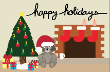
The second project we did was creating a holiday greeting card from scratch, and like the previous project this was also type based. This assignment was to come up with a phrase and then handwrite the phrase and place it into the card. We began by using pencil to create a basic design and then we would go over it in pen and finally place it into the computer. This project took around three weeks to complete. I faced many more challenges in this project than I did in the previous one. In this project I had the problem of being a perfectionist, I wanted my type to look perfect which was really hard because it was hand drawn. Once I got over my perfectionism I was able to continue with the project and finish it on time. Along the way I learned that I have the ability use hand written type and I learned the process for creating it. Along the way I also gained feedback on the visibility of my card, I was told that from far away it wasn't clearly visible and I had to fix it before turning it in. I changed the weight of the type which allowed it to be more visible. The feedback I was given gave me the opportunity to make my project better. Overall I wished I was able to finish my hand written type faster but I am still happy with how it turned out.

Scholar's Bowl Shirts:

This was my second client work project. I was given the ability to design the Olathe Northwest's Scholar's Bowl team shirts. They came to me with a design hastily drawn out on paper and I was able to turn it into multiple concepts to present back to them. This project took only about two weeks outside of class to complete. Some of the challenges that I faced was learning how to deal with a hard client, the person I was working with wasn't very informative and it was hard to keep in touch with her. Along the way I learned that I should treat the client as if they are always right even if I don't agree. Along the way I was given helpful tips on how to work with hard clients and when the client had feedback for me I changed it for her. Overall this was not my favorite project at all because of the difficulty in communication, but I am happy with the way my designs ended up.

The Aviary Posters:

I got the opportunity to be added onto the editorial staff of The Aviary which is Olathe Northwest's Student Literary Magazine. I was the graphic design editor and was given the assignment of creating a poster to promote the submission of work into the Lit Mag. I was given a list of essential information and I was given creative freedom and was able to present them with multiple concepts. This project took around two weeks outside of class since it was a client project. Some challenges I faced was making sure the poster wasn't all type and it had some eye catching elements. Along the way I learned how to communicate with clients better which made the overall process easier. While presenting the posters the group of editors found a few errors and changes that they would like me to make and I made them and sent them the final copy and everyone was pleased with the way it turned out. Overall I am pleased with how it looks and I think it was a cool opportunity to have my work put up around the building for everyone to see.

Raven 50 Poster:

This set of client work was handed to Amelia and I on short notice so it was very sudden. This assignment was to create a poster to show the essential information about the school's new lunch system. It had to include a schedule, a scalable QR code which led to sign up sheets, and also the teacher's schedules. This project took around two weeks to complete due to the fact that the poster was needed around the school. Some challenges that we faced was the overall design had to be simplistic but also be eye catching and easy to read. We created multiple concepts that didn't work so we had to go back to square one a few times. Even thought the project was hard I learned many valuable lessons including how to work with a partner on the project. I gained the ability to fully communicate both of our ideas and then combine them to create the a good poster. We were critiqued multiple times along the design process of the poster. With every comment we were given we took it into consideration and were able to fix the problem which led to creating a better poster. Some critiques included the need for a small logo on the poster and also creating better hierarchy within the poster. With all the feedback the poster slowly began to look better and look more unified. Even though this project demanded lots of creativity on spacing and hierarchy it was very fun to make and it is also very rewarding to see hanging around the school and the stickers that we also created on student's planners.

Company Branding:

This project was our next in class project and it was learning how to brand a company. We started by getting four items which had to be turned into a company we created. The items that I received were an elephant, amethyst, the number 7, and the letters z and y. I was able to combine those items into a safari company named the Gems of Africa based in Zimbabwe Africa. We spent the longest amount of time on this project over the semester because we spent around a month on it from start to finish. We spent time sketching ideas, and then creating the logo, creating business cards and letterheads for the company, and finally creating mockups for it. Some challenges that I faced was overcoming the lack of creativeness, as the project progressed it was hard to come up with original and creative ideas that benefited the overall look and feel of the company. Once I overcame that I was able to continue creating a brand from scratch. Along the way I learned how to brand a company from scratch and I also learned how to create a look that represents the brand but also looks unified across all the different aspects. Some feedback I received throughout the critiques that took place was that I needed to change the type on my logos because they didn't feel unified. Once I changed those the logo looked better as a whole and made the brand better as a whole. Overall this was my favorite project of the semester because I enjoyed turning four objects into a brand and seeing the whole thing come together when I got the project mounted. I am really pleased with how my company turned out and how the different aspects look when they are put together. 

Academy National Banners:

I was approached by two competitive horse back riders who were attending Academy Nationals. They asked if I had the ability to make them banners to represent them and promote their barn. This project took about one week because of the short window they gave me to get them done. I was given pictures that they wanted included and a small idea of some of the ideas they had and they gave me the freedom after that. Some of the challenges that I faced during this project was the unfamiliarity of Photoshop. I knew the basics going in but I had to constantly google tutorials to create different parts of the posters. Another problem I faced was the bad quality of the pictures, they began to look pixelated when I sized them up. Along the way I learned many new features and the abilities of photoshop. I am now more experienced using Photoshop and have more skills due to the project. Some feedback I was given were smaller things like they wanted a type font or they wanted things moved around which was very simple to change and fix. This project was harder than other set of client work I have been given because of the level of experience hat I have on Photoshop, but once I learned more of the basics I was able to fully create a banner that looked nice. In the end everyone was happy with how they looked including me. 

Natalie M Fashion Show Posters:


This client work project was to create a poster that promoted the fashion show. Junior committee came to me and asked for a visually appealing poster that conveyed the important dates and information. This project took around two weeks outside of class for me to complete. Some challenges that I faced along the way was working with a client who didn't know how to print out my poster. The poster was printed in both the wrong size and the fonts were messed up in the printing process. Once the file got sent to print again and came back I found that the poster was printed again wrong and it became pixelated. Due to the lack of time we were unable to print it out again so we hung it as is. Along the way I furthered my experience of working with difficult clients. Overall I was really pleased with how it turned out and I am happy that my poster is hung around the school but I was a little frustrated with the bad quality of the printed poster. 

Christ Community High School Retreat Shirts:

This project was one of my favorite client work projects. I was approached by my youth pastor with the opportunity to design the high school retreat shirts that would be passed out to the students. I was very excited to design this shirt because usually the camp concepts are designed by either college students or seniors and this was the first time a junior got to design them. This project took around a month because of all the effort I pout into the projects and I spent lots of time communicating with the client in order to design the best shirts I could. Some challenges that I faced along the way were making enough concepts that were various themes even when I had no ideas for that topic. I included multiple mountain concepts and also a fire concept. Along the way I learned what the best file type for print is. I also learned how to design simplistic and pleasing shirt design. I received feedback on the type that I picked because it wasn't his favorite but it was a simple fix that was sorted out quickly. Overall I was really happy with how the designs turned out and I am excited to see what the other students think. 

Time Management:

Throughout the semester I feel like I used my time really well and was able to complete everything in a timely manner. I was able to balance both in class projects and client work due to using my power 50 and after school time productively. When I finished on an in class assignment I would work on my client work until I finished those projects. I usually wouldn't have time to finish both my outside work and my in class work so I wouldn't be able to sit around doing nothing. To advance my skills as a graphic designer I continued to seek outside work so I could learn more and have more client experience and add to my portfolio.

Strengths & Weaknesses:

Throughout this semester I got to learn more about myself as a designer and find both my strengths and weaknesses. Some of my strengths include putting in all my effort to make a project as good as it can get. Another strength is time management. I was able to balance both in class and out of class projects and was able to get them done in a timely manner. Some of my weaknesses included perfectionism. I wanted all my projects to be perfect so I spent a lot of extra time on them. 

Reflection:

Overall I really enjoyed this semester and the projects we did. My favorite project was the company branding project and also the Winter retreat shirts. I also enjoyed updating my behance and seeing all my projects come together. I wouldn't change anything about the semester. Throughout the semester the biggest thing I learned was learning about type and how to pick the best type possible. A goal that I have for next semester is that I want to enter into eMagine and maybe place. 

Thursday, May 25, 2017

Video Semester Review

Takeaways

Throughout the semester I learned many valuable skills. I learned things that will help me with future video projects. I learned new skills with the technology and how to work with others and many more things. I also learned more about my areas of strength and my areas of weakness. I also learned how to overcome issues within projects. 

Technology

I learned many things with the filming equipment and the editing softwares. While we were creating entertainment pieces I got to learn how to use different types of microphones and I also learned more camera techniques. I got to also work more with Premiere Pro. I learned more techniques and how to edit different types of edits. I worked more with adding music and effects to the clips. I added fades and transitions to the video clips and I added music to the audio. Learning all these techniques is very important because when someone needs me to film something for them I will be able to edit it and make it look clean. Some challenges that I faced along the way is that the softwares were very confusing and I had a few issues while filming. One major issue that I had was that while my group was filming our short film we filmed an entire section without sound so we had to problem solve. 

Collaboration

This semester I worked more with groups instead of individually. Starting with the music video I worked in a group of four and I also worked in a larger group when I worked on recreating the Mean Girls movie trailer. I learned many things while working with others. I had to work with people I didn't enjoy working with. While working in groups I learned how to delegate tasks and help people follow through on their parts. Learning how to work in groups and work with people I don't like is important because I will have to work in groups later in my future and in my future job. Some challenges that I faced along the way is working with the same person multiple times in a row, this is a problem because my group member wouldn't follow through on his part of the project. 

Communication

While working in the entertainment section of video I learned the right was to communicate with others and I also learned the wrong way to communicate with others. One way that helped me succeed in communicating with my group members was creating a filming schedule. I learned that you have to talk to everyone as a group in person to set up the times when we would film. I also learned that I need to talk to them about each shot and talking to the director to make sure it's what they envisioned. These skills are very important for the future because I will need to communicate with my boss at my future job. Some challenges that I faced along the way is that while we were creating our production schedule for our short film we set the days that we were filming a week in advance and when it came time to show up at the filming location one of my group members didn't show up so we had to work without him. We faced miscommunication because no one knew what the plan was. 

Project Management

Project management this semester was a lot harder than it was last semester. Working on convergence last semester was more individual work than working in groups. Because I was working with other people that means that everything got done at different paces. I had to work with their schedules along with my own and because of that it was harder to edit things in shorter amounts of time. I spent more time coming in before or after school to get everything done and turned in on time. Learning how to work with deadlines is very important because I will need to get things done in different periods of time later in life. One challenge that I faced was working on my recreation of the movie trailer because I was running behind and I came in after school to work many time and I wasn't able to get it done by the time it was due. 

Leadership

I learned more about how I can be a better leader this semester while working in video. I learned how to be able to take charge and delegate tasks when work isn't getting done. I also learned how to approach someone and talk to them when they haven't done their part of the project.  But not only did I learn how to be a leader I also learned how to be a follower. I was able to learn that I have to let others take charge and I will do what they told me. Learning these leadership skills will probably be one of the most important things that I have learned this year because I will always have to work in groups and sometimes the work isn't getting done and I am now able to approach someone about it and talk to them. I will also have to be able to obey directions and listen to others who are also in my group. I did have to face challenges while trying to be a leader because I didn't want to sound annoying when I brought up the topic of getting the work done on time.

Strengths and Weaknesses

While creating all the projects I learned more about my areas of strength and weakness. Some of my strengths are working hard and collaboration. One goal I had this year was to make every project as good as it could be. I worked hard all year to get projects in on time and edit them to the bet of my abilities. My other strength was collaboration because I tried my best to work with everyone. Even though I had to work with someone I didn't like I still wanted to make the video look as good as possible. 

Changes?

If I could change anything I want to go back and re-shoot and re-edit my music video. I could have had better shots and I could have created a better production schedule to make the video better. I would then go back and change the way I edited it. I want to make the video better and make it more appealing to watch. 

Summary

Overall I learned many useful skills including working with others, working with new technology and learning the softwares, and I also learned how to be a good leader. All the things I learned are all very important because I will be able to use them in my future career and other aspects of my life. I really enjoyed creating all these videos and I feel like I have improved since the beginning of the year.


Tuesday, May 23, 2017

Graphic Design Semester Reflection

Takeaways

Throughout the year in graphic design I have learned many useful skills that will help me in the real world and in the design world. I learned multiple things in every area of guarantee. I learned technology tips, collaboration tips, communication tips, project management, and leadership skills.

Technology

I learned many things with technology. I have gotten much more comfortable with the softwares that I use for graphic design. I am much more fluent in Adobe Illustrator and Adobe Photoshop than I was in the beginning of the year. I know the purposes of the tools, how to use them, and when to use them. These new skills are very important because I can take what I learned and use it in future designing and i can also help other people use the softwares if they need help. Along the way I faced many obstacles including forgetfulness. After learning the tool I was very good at using it but when I didn't use it for a while then I forgot how to use it. I was still able to overcome that issue because i was able to go back and look at tutorials that would help me. 

Collaboration

I have worked with people since I was little but I still learned very useful tips this year in graphic design about collaboration. I was able to learn how to give constructive criticism when I was in a critique. This is very helpful because now I know how to make helpful tips during a critique. Along with giving tips I also learned how to accept criticism that I receive from others. I was able to receive criticism from people in my class, my teacher, and upperclassmen who are also in graphic design. Along the way I faced the challenge of giving criticism. Before I didn't know how to suggest helpful tips and it took a lot of practice to tell someone how they could improve their project. 

Communication

Throughout the last semester and year I have learned how to work with others and talk to them. I have learned how to ask people for help when I need help or if I want an opinion on my project. These skills are important because with them I have the ability to go to someone and ask for help of ask for something if I need something. Along the way I had to face my fear of asking people I don't know well for something. 

Project Management

With project management I have been able to learn how to successfully meet a deadline. I have been able to use my time wisely and balance different things in order to get everything done. I was able to stay after schools when my project wasn't done so I could get it done and turned in on time. These skills are very important because if I chose to pursue this as a career I will need to be able to get things done in time for the clients. It is very essential that I stay with the schedule so everything is done on time and it is done to the best of my ability. I struggled a lot with project management because I am a perfectionist and I want everything to be as close to perfect as possible. Because I am a perfectionist I had to stay after school a lot to get it all done. The only problem with staying after is that I was a nanny after school so I couldn't stay after everyday so I had to manage my time better in class. 

Leadership

I learned many necessary leadership skills. I am able to help people with a project that they don't understand. These skills are important because I am able to apply them in my career later in life. I will be able to help others and ask for help if I need it. 

Strengths and Weaknesses

Some of my strengths is that I am hard working. I want to get everything done to the best of my abilities even if I don't like the project. Another strength that I have is that I am very good at collaborating with others. I am good a working by myself or working with others. I am also good with project management. I want to get every project done and turned in on time and make sure that it is done with my best effort. While I have some strengths I also have a few weaknesses. One of my major weaknesses is that I am a perfectionist. I want everything to be perfect and if I don't like it then I will change it until I do. The main issue with this is that I would work for a long time on certain projects and I had to stay after a lot. I have improved greatly this year because while I want everything to look nice and be done to the best of my abilities I am not staying after as much to redo it again. I still need to work on communication skills because I don't like presenting any projects in front of the class. I don't enjoy public speaking and when we had to present our graphic designer history project I really struggled. 

Why This is Useful

All the skills that I learned are all equally important. I will be able to apply those in all areas of my life not just in class. I will be able to use all this information throughout my life. I will be able to fluently use the softwares that I have learned this year. I will also be able to work with others and give constructive criticism. I will also use what I learned about communication in future jobs. I will be able to use project management skills later in life because I will be aware of my deadlines and how much time I need to spend working. I will be able to use my leadership skills also in future jobs and areas of my life. 

Changes?

If i could change anything I would go back and change all my early projects. Projects like the raccoon were not done very well and I would use all the information that I learned and I would apply it to those projects. I want to change that project because when I completed it I didn't know much about the softwares but now that I'm much more comfortable with them I could make the projects ten times better. 

Summary

Overall I learned more this year than I thought I would and I also enjoyed graphic design more than I thought I would. When I started the class I didn't know anything about the design softwares and I didn't know how to use them. But now I am much more fluent in the skills that I learned. I also felt very lost in the beginning of the year because I was behind on everything and i didn't understand but now I understand much more and i am not falling behind. 

Tuesday, March 21, 2017

Movie Trailer Recreation


Assignment:

The assignment was to pick a movie trailer that took place in school and recreate it. Some of the rules for the project were that we had to recreate the trailer shot for shot and edit for edit.  That means we had to do every shot that was in the trailer. We had to have similar costumes, the same camera angles, and the same length as the real trailer. The purpose of the project was to learn about advanced camera shots and lighting. 

Pre-Production:

I was working with a group of two other people and we chose the trailer Mean Girls. To start the project we began by writing the script, we had to transfer all the lines that were in the trailer onto paper that we printed off. The next step was to create a storyboard of every shot in the trailer. By the end of the storyboarding process my group had a total of 130 shots. After story boarding and writing the script we began to create a production schedule, we picked what days and where we were filming and when. After the production schedule was finished we made and cast and costume list. We started to pick people to play the characters. We also made lists of the costumes each person needed to have. 

Production:

Once all of the pre-production was finished we began the production process. The production process took the longest because of the amount of scenes we had to film. We filmed some of our scenes within the school during class but the rest of the shots were filmed outside of class. We came in on a Saturday to film the in school scenes and once we had finished the schools scenes we went to someones house and shot the party scenes, with each shot we filmed it multiple times to get it right.

Post-Production:

After we had finished filming everything the next step was to begin editing. We started by going through all the clips and deleting the ones that were bad or unusable. After we shorted through the clips the next step was to import them and name them. Once everything was in Premiere Pro and named I began laying them out in the timeline. After everything was laid out I began to synch them to the timing of the real trailer. I would put both side by side and watch them and edit mine to match the real trailer. After everything was matched up I began to search for the music that was in the trailer. Throughout the trailer there were around 5 songs total. The hardest part of editing was getting the timing right with the real trailer. 

Reflection:

Overall I am happy with my project, I like the shots that I got and how they are very close to the originals. I am also happy with how the final edit turned out, it all came together in the end and looks decent. There are also things that I would change if I could go back. I would make sure we had all the shots because we are missing a few. I would also plan it out better and make sure that we know what shots we are filming and when to make sure we don't miss any. I would also go back and film the night scenes again because they are to dark. the only other thing I would change is that I would make sure that we had the extras that we needed because a few of our shots didn't have as many people as we should have so we improvised. The hardest part of the project was time management because we didn't have as much time as we thought and we should have spent more time filming and editing than in pre-production.

Marks and Symbols

Summary:

Marks:
Logos for companies are everywhere, including on clothes, signs, posters, and billboards. As graphic designers there is an importance to know about the different types of marks. There are six different types and they include symbols which is just a graphic with no words, another type is a pictograph which is a graphic that represents a public place, that includes bathroom signs and handicapped signs. The third type of mark is a lettermark which is a abbreviation for a longer company name. Another type of mark is a logo. A logo is the opposite of symbol, except a logo is just the company name and no graphics. When a logo and symbol are combined it creates a combination mark, most companies have a logo, symbol, and a combination mark. The last kind of mark is a trademark, a trademark is a mark which shows that the mark can't be used without permission. 

Symbols:
Many things make up a good symbol which includes thinking about color, reduction sizes, symbol weight, taking negative space into consideration, and many more. There are around eleven things that make a symbol good. After thinking about each one that will help create a well designed symbol for a company. 

Logos vs. Symbols:

While logos and symbols seem like the same there is actually is a large difference between them. Logos include type while symbols don't, logos are the name of the company. Some advantages of using a logo are that they are easier to promote and they are very unique and easy to understand. Symbols are the opposite of logos, symbols are just a graphic and no type. Some advantages of using a symbol are that they are also are unique and easy to see, a disadvantage is that they are hard to understand.

Key Ideas:

After reading the article I learned a lot about developing a symbols and marks. One thing I learned was the six different types of marks. I learned about the different types and what they each are what advantages and disadvantages they have. Another thing I learned was about close gestalt. Close Gestalt is important in designing a symbol and it means that you need something simple and compact to draw the audiences eye to the symbol. The last thing that I learned was that the symbol needs to be able to reduced down to 1/2" or smaller. While being sized down the logo can't loose any of its aspects and still needs to be easy to see. My favorite thing that I learned was learning about developing a symbol. Learning about symbols will be important late in my graphic design career because every business needs a well designed logo, symbol, and combination mark.

Conclusion:

Overall the article was very easy to read and understand. I learned many things about the different types of marks and the components of symbols. I will be able to use what I learned later in my graphic design career. 

Wednesday, February 1, 2017

Music Video Remake


Pre-Production

For the first project we did in the entertainment side of our video class was to pick a song and make a music video for it. The pre production of the project was a lot of paperwork and planning. We had to get the copyright information and then print out all the lyrics. The next part was to begin planning the production of the video, we started by picking a location and figuring our who was going to star in the video. After the general planning was done the next step was to plan out and draw each shot and write about it. We listed the angle, what type of shot it was, and what part of the song it would fit with.

Production

Once we finished the pre production work the next part was to begin production, the group I was in decided to film by the Kansas Bioscience Park and we spent a total of 6 hours spread over three days filming the videos. The filming was a long process that included reshooting many shots and filming them different ways and getting different angles. Once we had a large amount of footage of the main singer we then focused on b-roll shots; shot of the plants and location we filmed at. 

Post-Production

After we had completely finished filming we then began the post production stage. We loaded all the footage onto the computers and began editing. Editing was the hardest part because all the clips looked the same and they had to be fit perfectly to the music.

Reflection

Overall I learned a lot on creating and editing a music video,  I learned how to film one and then start to piece clips together. The hardest part was editing the video to the beat of the music but once it was some what edited to the beat it looked very cool. The parts I really liked about my video was the shots I got, I was very happy with the variety of shots I got and how I edited them together. If I could change anything I would edit more to the beat because it could have been done better. Another thing I would have changed is that I would have a better variety of shots. 

Thursday, January 19, 2017

Posters

The Character and Function of the Poster

In my graphic design class we began to analyze what makes a poster a poster, we started by reading an article about posters and what makes a good poster. The first part of the article was called "The Character and Function of the Poster", it was about what a poster is supposed to do. The first function of the poster is to communicate something about an event, whether it's a political event or a cultural event. The second function of the poster is to get people to notice it by putting it in different location so large groups of people have access to it. The third function of a poster is to also give information in a pleasing way, so information is included along with vivid graphics. Posters are supposed to also convey an emotion that can range from sadness to happiness.

The Laws of Poster Designing

The second half of the article was titled "The Laws of Poster Designing", this half of the article was about how to design a striking poster. The article gave points about what makes a poster stand out from all the others in the same area, the posters need to be striking and be able to get information across in a clear and concise manner, good posters need a balance of color, rhythm, contrast, form and many more to stand out to people and catch their eye. The next thing that good posters have is the general demands of poster-designing, that includes a clear and readable poster, an interesting poster, and a memorable poster. Another thing that is essential to creating a good poster is that it needs to follow lettering in poster-designing. Lettering in poster-design is when all the font used flows and is connected including the size, color, placement, and making sure it is still legible and understandable at a distance. Not only does the font have to connect but the information and graphics also need to connect and have a good balance. Lettering isn't the only thing needed to succeed in creating a stunning poster but a balance between shapes, colors, and graphics need to also be applied to the designing process. The point of the poster should be recognized easily and the colors and shapes need to have a general connection and need to create a pleasing balance. Hierarchy needs to also be applied to making a poster, the information needs to be placed accordingly to importance so the audience can comprehend it quickly. Different placements of shapes can produce a variety of effects, including a more elegant feel, a lighter feel, a more static feel and many more. The feel of the poster comes from the placement and use of shapes. Along with shapes and lettering the color of the poster also makes a difference in the overall feel of the poster. Color can symbolize different things including emotions, color also creates rhythm throughout the poster. 

Importance 

As I read the article I learned about the creation of a good poster and what was included in making it stand out. One thing I learned was about the laws of poster-designing and how by incorporating the rules about shape, color, and lettering that changes the feel of the poster and can make the poster stand out to the people looking at it. The next important thing I learned was the purpose of the poster, everyone knows the basics of a poster but after reading the beginning of the article it makes the function of the poster clear. A poster is supposed to catch the readers eye and make sure the reader can understand the information. The last major thing that I learned was the facts about lettering and how it needs to be balanced and the fonts used need to connect and have a balance with the size and where they are placed. 

My Favorites

My favorite part of the article was when it was taking about the laws of poster-design because they had clear sub titles that told you what the paragraph was about and the points made in the paragraph were also very clear and easily understandable. They will be valuable in the future because when I need to design a poster I now know how to make it eye catching and easy to understand. Overall I enjoyed the information the article had and how it was a easy to read and comprehend writing. 

Monday, December 19, 2016

The Feral Child Feature Story Review

Overview:

I read the Pulitzer prize winner feature story The Feral Child and it was about a girl that was neglected and was locked in a room, with only a few things. She was treated badly and the conditions she was in were very bad; the room was infested with cockroaches, and she was surrounded by her own filth. She was also very uneducated and didn't understand things kids her age should have known, and she is what scientists call a feral child. The authors argument was stating that the girl they found was a feral child, and feral children are kids that grow up with little interaction and how that is a wrong way to treat people. The author shows what makes a child become a feral child and he went through the story of the young girl and how far she has come since her abuse. The author also talks about feral children and what they are and how they got to be the way they are, the author uses other sources about feral children and he gets accounts from witnesses who saw the girl. The author also uses this story about the young girl as an example of a feral child.

Strengths and Weakness:

The articles strengths are that it has an example that explains what the story is about and it gives good details. Another strength is that the article has many different sources having definitions dating all the way back to the Holy Roman Empire and the most recent source which was 1970. A weakness in the article is that the feature story jumps around too much, there are sources from long ago and then it jumps right back into the story about the young girl, and because the feature jumps around a lot it gets confusing and hard to understand.

Conclusions:

The author concludes the feature story by going to the present to see how the young girl has developed and changed, it talks in detail about how far she has come and while she isn't where other kids her age are she has learned more than they thought she would. The story also ends with what consequences the mother is facing because of her abuse towards her daughter.

Summary:

The article was a very well written feature story and it supported all the main ideas of defining a feral child and showing the different cases of them and how rare they are. The article follows the story of a young girl who was a feral child and her mental growth was stunted due to her harsh conditions. the points were very significant because it showed what can happen when kids are treated poorly and how they deserve the best treatment. The evidence is very convincing because there are so many different examples and cases that show all the different feral children and they are all spread out through different time periods which shows how the have always existed and there have always been a few cases. As a videographer I will use the strengths that I found in the article and can apply those to my future work if I chose to go into convergence as my main focus. I can use what I learned about the format of feature stories and use that to make my work better. While the feature story is very well written there are terms in the article that are more difficult to understand and some prior knowledge is needed just for the basics or what a feral child is and how they become feral children. Overall the feature story is written extremely well and while it is slightly confusing at times everything is explained well and it has details to help you picture the girl's living conditions.

http://www.pulitzer.org/winners/lane-degregory


Sunday, December 18, 2016

Graphic Design Reflection

Overview:

Throughout the semester my skills in graphic design my skills have improved quite a bit. Coming into this class in the beginning of the year I knew very little but now after a short semester I have learned about fonts, color schemes, and how to use Adobe Illustrator and Photoshop. Not only have my technical skills improved but my collaboration skills have also improved. My collaboration skills have improved because I got the opportunity to receive feedback from juniors and seniors who are in graphic design and my peers. I have also gotten the chance to work with a partner on a project and run ideas past each other.

Projects:

Photoshop Tutorials:

The first project of the year was Photoshop tutorials, the goal of the videos was to help us get comfortable with the tools in Photoshop and apply them later in graphic design. Each tutorial focused on a certain tool so we could learn in depth what it was for and how to use it. The project took around two weeks to finish completely. While most of the tutorials were short and simple there were a few that were more challenging than others. The one that I struggled with the most was removing certain objects from a picture and while still making it look realistic and not photoshopped. As I was going through all the videos I learned a lot about Photoshop and its tools. I learned how each tool worked and when I should use certain tools over others. Some feedback I received as I went through each tutorial was to take my time and not to rush no matter how simple the tool is. I learned that I need to put forth my best effort for every project even if I don't enjoy it because every project has a lesson about graphic design that is necessary to learn. Overall I think I could have slowed down on the design process because I could have cleaned up each project. Even though I feel like I could have slowed done I am still happy with how they turned out overall.

Fall Raccoon and Postcard:

The next project we did after the Photoshop tutorials was to create a fall raccoon and create a postcard, the project was to help us get to know the tools in Adobe Illustrator. The process for creating everything was to first follow a tutorial to design the raccoon and the fall foliage. Once everything was done we began to rough draft our post cards, I decided I wanted a holiday theme. I began to create the things featured in my postcard including the Christmas tree, the fireplace, the stockings, and the Santa hat for the raccoon. Once I had designed everything and had it laid out I started to work with typography so I could include a handwritten font on my postcard. Just like the Photoshop tutorials the raccoon project took around two to three weeks to get all the way through. Some of the challenges that I faced throughout the entire project was understanding the tutorials.
 Since the tutorials were not videos this time but instead they were step by steps pictures it was harder to understand what tools and where the tool were. Throughout the project I learned how to follow directions a different way than before. I also learned the Adobe Illustrator tools and when to use them. I received a lot of positive feedback during this project, I got comments on my handwritten font and how my raccoon turned out. Overall I am much more happy with the process and outcome much more than my Photoshop tutorials. I stayed after school multiple times to get the project done to the best of my ability and I am very happy with
the way it looks overall. 

Vectored Image:

The next project we did in the graphic design was the hardest project and the one that took the most time. Our assignment was to created a vector of ourselves based off of a head-shot we had taken in class a few days ago. The most used tool on this project was the pen tool to trace the parts of the image and the eye-droppper to match the colors as closely as possible. The hardest part of the project was having the patience to finish it. The other hardest part was to get it done in time, I wanted to get every detail in the vectored image and I wanted it to be perfect. I had to learn how to use my time well and get as much done as possible. Throughout the project I learned how to use the pen tool and use a few of anchor points as possible and I also learned how to use tints and shades of colors to show highlights and shadows in my skin and clothes. I am very happy with how my image turned out and I used my time well and I was able to get everything done on time because I stayed after school multiple times to get everything completed. 

Infographic:

One of the last projects of the semester was to create an infographic about a certain topic. Creating the infographic was my favorite project of the entire year. The process of the project was a lot longer than any other project we had done. On the other projects I was able to just jump in and begin designing but for the infographic we had to do research to know what topics we wanted to show on the poster. The project took the longest, we did research for a week, we planned out the layout, and then we began creating the graphics. The hardest part of the project was figuring out the balance between too much information and not enough information. Once everything was created and laid out we had a critique with the upperclassmen. I got lots of positive feedback and constructive criticism. I was advised to change my font and change the sizes of stuff, but overall they liked where I was going with my infographic. With all the feedback that I received I changed the styles of font numerous times and I also changed the sizes of things. The last thing I changed was the icons of some of the movies I represented. Overall I am extremely happy with how my project turned out and I'm happy that with the time that I had left after I finished I was able to go back and change things so as an end result it looks better than it did. 


Milton Glaser:
The last project of the semester was too create a presentation of a graphic designer who impacted graphic design history. My graphic designer is Milton Glaser, we started off the project by researching our person and then we wrote a two paged paper over them and then we started creating the slides. For our presentation we have to create a minimum of five slides to show information about our person. The slides have to show their style of graphic design and highlight the most important facts about them.


Time Management:

I feel like overall I have used my time very well in class, and when I don't get everything done that I needed done I will stay after school to finish the project so I can turn them in on time. When I finish a project early I will go back and clean it up in any way possible and I also get others to look at it to give me feedback. Outside of class when I'm not working on any of my projects and I'm driving somewhere I will look at other posters that are created by graphic designers and I will notice things about theirs that I like so I can incorporate things like theirs into my work.


Strengths and Weaknesses:

Some of my strengths as a graphic designer is time management and putting all my effort into a project to make sure it is my best work. I always try to make sure every project is done to the best of my ability. I also try and make sure that all my projects are done on time even if that means staying after school to get caught up. I maximize my strengths by continuing to think about what can be done better and how can I improve this project. My weakness as a graphic designer is being a perfectionist, I always want every project to be perfect and I will spend too much time working on it if I'm not careful and I always have to make sure that I get my projects turned in on time.

Summary:

Overall I have really enjoyed the semester in graphic design and I feel like I have learned a lot throughout the semester. My favorite part so far has bee creating the infographic because I enjoyed picking my topic and designing it completely from scratch. I wouldn't change anything bout graphic design other than not doing another history of graphic design project. My take away from this semester is learning how to balance my time and manage my perfectionist personality to make sure projects get done on time. My goal for next semester is to have everything turned in on time and put all my effort into every project. 

Wednesday, November 30, 2016

ONW feature Story 2

Assignment: Our next assignment in Video was to create another feature story. I chose to create a feature story over my dad and my younger sister on how they play the piano on Sunday mornings at Westside Family Church, and how Darren inspired Sara to begin to play the piano and start to play at church.

Pre-Production:
To start the project I researched the topic of playing the piano. I found out statistics and fun facts about pianos and people who played the piano. After researching the topic I wrote out the 21 interview questions for each person and I decided where I wanted to go with the story. I decided that I wanted to show how Darren played the piano for the church and that inspired his youngest daughter Sara to play the piano for the middle school service. 

Production:
Once I finished writing the questions and researching I started to collect B-Roll and interview Darren and Sara. For the B-roll I got a variety of shots with them playing the piano, Darren working with Sara, and them looking at sheet music together. I also went on Wednesday night to go to Darren;s practice to get shots of the band playing together. After I collected all the B-roll and interviews I downloaded all the footage and began to edit it. 

Post-Production:
After everything was filmed and downloaded onto the computer I began getting sound bytes from the interview. I got the sound bytes by taking the pieces of the interview that I needed to put into the feature story. Once that was done I started to write the script for the voice overs, and placed everything together for the final script. Then I went into the studio and recorded the voice overs and then downloaded them onto the computer. The next step was to piece everything together; I started by laying out the voice overs and the sound bytes into the timeline to get a guide of where I wanted everything. Then I started going through the B-roll and choosing which clips I wanted and where they needed to go to make sure that they feature story flowed. Once everything was in place in the timeline I began to adjust the sound levels to get an even sound throughout the entire video. Once the rough draft of the video was done I watched through the video and made sure I had no jump cuts and if I did to make sure B-roll covered them.

Reflection:
Overall I am happy with my project because I had more than enough B-roll and I talked slower while filming my voice overs. If I could change something I would change the variety of the types of shots I had. I would incorporate more of the six shot system, I would et more close-ups, medium shots, and extreme close-ups. I learned how to get more B-roll and edit the sound to make sure the audio levels are even and I also learned how to create a better feature story. For the next project I will use what I learned about B-roll and how I need more than I think I will. 

Sunday, October 30, 2016

ONW Feature Story


Assignment: 
The project I have been working on in video was a feature story. We had to find someone to interview and create a story about them, I did my feature story about my friends grandparents Denny and Judy Briley. I interviewed them about a medical mission trip in Guatemala that they participated in.

Pre-Production:
To start off the project I started by writing out my 21 questions to ask them. I decided on asking them things like what is a medical missions trip, what was your role on the trip, what was your favorite part, and why did you want to go. Once all my questions were written out I asked them for any background information that I might need for the project and they gave me the blogs for the trips and I read through both and edited my questions based off the blog. After I had read the blogs I then talked to them about when a good time to interview them was.

Production:
When I started filming the video I started by having them sit in their living room on the couch and I talked them through how the interview was going to happen. When I started the interview I had my mom help me and hold the camera so I could sit to the side and have them watch me instead of the camera. After I asked all my questions I started to brainstorm how to get B-Roll. I decided that I was going to do basic shots like hands of a keyboard, a tack in the location that they went on a map, and a over the shoulder of a Judy sitting at a computer.

Post-Production:
When I got to school on Monday I started the editing process, I downloaded everything and began creating sound bites of the interview. Once I finished that I started to write out my voice overs and then filmed them. Then I started to piece everything together and I used screenshots of the pictures that were taken on the trip and then posted on the blog to put as extra B-Roll on my video.

Reflection:
Overall I think I did okay on this project and if I had more time I would have found more creative ways to get more B-Roll and the other thing I would change is the speed that I talk in during my voice overs. I have learned throughout the last project and this one that I am a very fast talker and that I need to learn how to slow down. The part that I would not change if I went back would be my interview, I really liked how it turned out with the lighting.

Monday, October 24, 2016

Vectored Image

The second project we did in graphic design was to create a vectored image of yourself based off of a headshot we had taken. I used to pen tool to outline and trace most of my face and shirt while I used the brush tool to do my hair. I also used the eyedropper tool to get close to the colors that I would need to have realistic shades of color for my skin, hair, and clothes.


Fall Raccoon and Postcard

The goal of the next graphic design project was to create a raccoon and make both a fall scene and a postcard. I started out by creating the raccoon and placing it onto a solid colored background. The next step in the project was to begin creating leaves and foliage to put into the fall scene. I created different types of leaves, acorns, and branches. Once everything was done I began to add them altogether to make the fall scene. I decided to have the raccoon the main focus point by having him on a pile of leaves with the foliage I created behind it.


Once I finished the fall scene I had to make a postcard and somehow incorporate my raccoon in it. I decided that I wanted the theme of my postcard to be a Christmas card. I started out by creating the tree and ornaments with the presents, then I made the fireplace and stockings, and then I created the santa hat for my raccoon. The last thing I added on the postcard was my handwritten typography, I wrote it out on paper and then scanned it in on the computer. Once the front was done I added the presents and type onto the template of the back of the postcard. 


Friday, October 7, 2016

ONW 1 in 2,000 an Audio Interview


The assignment was to interview someone about something interesting about them, so for my project I interviewed CJ about the high school football team. The project guidelines were that it had to be an audio file, it had to be 60-90 seconds long, and it had to have sound bites and voice overs in it.

Pre- Production:
To start the process to create our interview we started by getting to know them. While getting to know them we had to find out something interesting about them and pick what the focus of our interview was going to be. CJ was my partner and while I was talking to him about what he liked to do I found out that he was on the high school football team and he really enjoyed playing. After we had picked what we were going to interview our partners about we had to write out our 21 questions. The layout of the 21 questions is:
  • 1: Asking their name and how to spell it
  • 2-4: Background questions
  • 5-8: Who, What, Where, and When questions
  • 9-18: How and Why questions, asking them to describe and explain things
  • 19-20: Greatest hope and fear
  • 21: Asking if there is anything they want to add
Production:
After all the questions were written we started production by filming our partner and asking them our questions. We had to take them to a place that is part of their story and since I was interviewing CJ about the football team I took him outside and onto the football field to interview him. Once I had the video I went back inside to start the editing process.

Post- Production:
Once I was inside and had uploaded all my videos I started to edit them. In the video I found the answers to the questions I had asked and I saved them as sound bites to use in the final audio file. After I found and saved my soundbites I started to write my script for the voice overs. When writing my script I kept that we had to do more talking than our partner in the video in my mind. After writing my script I filmed my voice overs and inserted them into my video.

Reflection:
As I made the video I learned about editing audio and how it is harder than it looks. The other thing I learned was how to correctly film a interview and once it was imported only use the sound and not the video part. I also learned collaboration because I had to work with my partner so I could interview him. If I could go back and change some things I would change the speed that I talked at, I talked really fast and that is not good for interviews. The things that I would do the same would be the transitions between voice overs and sound bites. The experiences that I learned this time and that I can use next time is how to set up an interview starting with the 21 questions and then asking them in one long video. Overall I learned a lot about interviewing someone and editing audio that I will use in later video projects.

Saturday, September 10, 2016

Photoshop

During the past week and a half I have been working on multiple photoshop projects to expand what I know about Photoshop. Going in I knew very little but after I have finished them I can use Photoshop more fluently now. I have learned how to increase the canvas size, use the different tools, add and remove areas of pictures, and make collages of multiple pictures.

Finished Projects:

Project 1- Content Aware:
For the first group of projects that I did was using the content aware tool.  The content aware tool is very useful because if the photo has a unwanted area then the tool can be used o remove the unwanted area. Each photo had a blemish or an unwanted spot in it so I used the content aware tool to select and change the unwanted spot into something that was already in the picture. For example, the surfboard had a logo right in the center of it so with the content aware tool I was able to remove the logo and replace it with the background of the surfboard. For the man standing against the white wall picture I had to remove blemishes from the wall. The wall was covered in scratches and holes so I used the content aware tool and was able to clean the wall up and make it not look beat up. The content aware tool was very helpful when I needed to use some background to cover up a unwanted area. 


Project 2- Patch Tool:
The next project I did was editing out more unwanted areas using the patch tool. Just like the content aware the patch tool also removes any unwanted areas quickly and cleanly. For the picture I edited, it was a picture of a dad and his daughter and on his shirt was an unwanted logo so I used the patch tool to pull out the logo and replace it with the plain blue shirt. 


Project 3- Cloning and Healing:
For the third project I used another tool to get rid of areas that are not needed. I used the cloning stamp instead of he patch tool and content aware. Although an one of those tools can get rid of unwanted areas the clone tool can be used for small areas. The clone stamp is very helpful because you copy an area that you want to use and when you color over the unwanted area with a brush the area you copied goes over it. So for this project I had a picture of a girl wearing a coat but the problem is that there is a large white tag on the coat by the pocket. So I used a combination of the clone stamp and the healing brush to get rid of the tag and to go over the area and make it look real.  


Project 4- Clone Stamp and Patch Tool:
The next project I did was a combination of using the clone stamp and the patch tool. I had to start with the clone tool to take out the distractions in the picture which would have been poles and buildings behind the picture of a dad and his daughter. After I had gotten rid of the distractions the next step was to use the patch tool to make everything blend together and make sure it looks unedited. I had to blend the parts of the sky to make it completely even across the entire picture.


Project 5- Spot Healing Brush:
On of the last projects I did was learning how to gt rid of blemishes on a face. I used the spot healing brush to get rid of dirt on a black and white closeup of a little boy. I learned that the spot healing brush is for smaller blemishes that someone could tell that it was edited. So on the closeup I had to make small selections with the spot healing brush that would blur it and change it to what the other parts on the picture looked like. 


Project 6- Portrait Collage: 
 The hardest project that I did during the entire week was making a portrait collage. It not only was the hardest but it was also the most time consuming. I had to combine everything that I learned in previous projects and use it to finish this one and it took multiple days and lots of hard work. There were many steps to finish this including editing each picture individually, putting them all together, blending the background with the clone stamp, and then adding background to the ones that needed it. On top of all the editing I also had to make sure that it didn't look messy.  


Project 7- Products:
For project seven I learned how to put a graphic onto an image and how to advertise it. I had an image of a bottle and I had an image of the graphics that needed to be put onto the bottle so i learned how to insert them and make them transparent like thy would be on a bottle someone could find in a store. I also learned how to change backgrounds and add a shadow and a light effect behind the product. The other thing I learned in this project was how to insert an image onto a blank billboard. I ad to insert the image and then warp it to fit onto the corners of the billboard to give it a 3D look.


Project 7- Challenge:
Project seven was the last one and it was an optional challenge piece, I received a group of images and had to use what I had learned and create something. I used the clone stamp to get rid of rocks in the background and I also used the transform tool to flip the background to create an even backdrop. I also create many layers to create a double exposure effect on his suit coat and I used the spot healing brush to get rid of small things in the background. 


Reflections:
My favorite project was the challenge because I really enjoyed the freedom and being able to create anything with what I knew and there were endless possibilities. My favorite skill that I learned was learning how to use the spot healing tool and that is very important because I love photography and if I take any pictures and the subject in the photo has a small blemish or I don't like one area I can use that tool and correct it. Overall my strengths were being able to catch on fast and understand the use of the tools. While I do have strengths I also have weaknesses and my weakness was probably perfectionism, I am a perfectionist and I want something to meet my standards even if I haven't completely learned it so that was hard when I was trying new Photoshop techniques. If I could go back and change something in any of my projects I would probably go back and touch up on patch tool project. The shirt doesn't look as real as I would have liked and I would want to go back and fix up the edges. On the flip side if i could keep anything the same I would want to keep how I did the portrait the same. I feel like I did a good job on that one and I am happy with the way it turned out. Overall I really enjoyed the projects because I learned a lot about Photoshop that was really helpful. I only had a tough time with two of them and I feel like I did a good job on the projects overall.