Overview:
Throughout the semester my skills in graphic design my skills have improved quite a bit. Coming into this class in the beginning of the year I knew very little but now after a short semester I have learned about fonts, color schemes, and how to use Adobe Illustrator and Photoshop. Not only have my technical skills improved but my collaboration skills have also improved. My collaboration skills have improved because I got the opportunity to receive feedback from juniors and seniors who are in graphic design and my peers. I have also gotten the chance to work with a partner on a project and run ideas past each other.Projects:
Photoshop Tutorials:
The first project of the year was Photoshop tutorials, the goal of the videos was to help us get comfortable with the tools in Photoshop and apply them later in graphic design. Each tutorial focused on a certain tool so we could learn in depth what it was for and how to use it. The project took around two weeks to finish completely. While most of the tutorials were short and simple there were a few that were more challenging than others. The one that I struggled with the most was removing certain objects from a picture and while still making it look realistic and not photoshopped. As I was going through all the videos I learned a lot about Photoshop and its tools. I learned how each tool worked and when I should use certain tools over others. Some feedback I received as I went through each tutorial was to take my time and not to rush no matter how simple the tool is. I learned that I need to put forth my best effort for every project even if I don't enjoy it because every project has a lesson about graphic design that is necessary to learn. Overall I think I could have slowed down on the design process because I could have cleaned up each project. Even though I feel like I could have slowed done I am still happy with how they turned out overall.Fall Raccoon and Postcard:
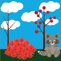
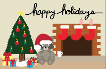
 The next project we did after the Photoshop tutorials was to create a fall raccoon and create a postcard, the project was to help us get to know the tools in Adobe Illustrator. The process for creating everything was to first follow a tutorial to design the raccoon and the fall foliage. Once everything was done we began to rough draft our post cards, I decided I wanted a holiday theme. I began to create the things featured in my postcard including the Christmas tree, the fireplace, the stockings, and the Santa hat for the raccoon. Once I had designed everything and had it laid out I started to work with typography so I could include a handwritten font on my postcard. Just like the Photoshop tutorials the raccoon project took around two to three weeks to get all the way through. Some of the challenges that I faced throughout the entire project was understanding the tutorials.
 Since the tutorials were not videos this time but instead they were step by steps pictures it was harder to understand what tools and where the tool were. Throughout the project I learned how to follow directions a different way than before. I also learned the Adobe Illustrator tools and when to use them. I received a lot of positive feedback during this project, I got comments on my handwritten font and how my raccoon turned out. Overall I am much more happy with the process and outcome much more than my Photoshop tutorials. I stayed after school multiple times to get the project done to the best of my ability and I am very happy with
the way it looks overall.
Vectored Image:
 The next project we did in the graphic design was the hardest project and the one that took the most time. Our assignment was to created a vector of ourselves based off of a head-shot we had taken in class a few days ago. The most used tool on this project was the pen tool to trace the parts of the image and the eye-droppper to match the colors as closely as possible. The hardest part of the project was having the patience to finish it. The other hardest part was to get it done in time, I wanted to get every detail in the vectored image and I wanted it to be perfect. I had to learn how to use my time well and get as much done as possible. Throughout the project I learned how to use the pen tool and use a few of anchor points as possible and I also learned how to use tints and shades of colors to show highlights and shadows in my skin and clothes. I am very happy with how my image turned out and I used my time well and I was able to get everything done on time because I stayed after school multiple times to get everything completed.
 Infographic:
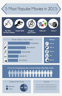
 One of the last projects of the semester was to create an infographic about a certain topic. Creating the infographic was my favorite project of the entire year. The process of the project was a lot longer than any other project we had done. On the other projects I was able to just jump in and begin designing but for the infographic we had to do research to know what topics we wanted to show on the poster. The project took the longest, we did research for a week, we planned out the layout, and then we began creating the graphics. The hardest part of the project was figuring out the balance between too much information and not enough information. Once everything was created and laid out we had a critique with the upperclassmen. I got lots of positive feedback and constructive criticism. I was advised to change my font and change the sizes of stuff, but overall they liked where I was going with my infographic. With all the feedback that I received I changed the styles of font numerous times and I also changed the sizes of things. The last thing I changed was the icons of some of the movies I represented. Overall I am extremely happy with how my project turned out and I'm happy that with the time that I had left after I finished I was able to go back and change things so as an end result it looks better than it did.
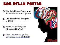
  The last project of the semester was too create a presentation of a graphic designer who impacted graphic design history. My graphic designer is Milton Glaser, we started off the project by researching our person and then we wrote a two paged paper over them and then we started creating the slides. For our presentation we have to create a minimum of five slides to show information about our person. The slides have to show their style of graphic design and highlight the most important facts about them.
Time Management:
I feel like overall I have used my time very well in class, and when I don't get everything done that I needed done I will stay after school to finish the project so I can turn them in on time. When I finish a project early I will go back and clean it up in any way possible and I also get others to look at it to give me feedback. Outside of class when I'm not working on any of my projects and I'm driving somewhere I will look at other posters that are created by graphic designers and I will notice things about theirs that I like so I can incorporate things like theirs into my work.
Strengths and Weaknesses:
Some of my strengths as a graphic designer is time management and putting all my effort into a project to make sure it is my best work. I always try to make sure every project is done to the best of my ability. I also try and make sure that all my projects are done on time even if that means staying after school to get caught up. I maximize my strengths by continuing to think about what can be done better and how can I improve this project. My weakness as a graphic designer is being a perfectionist, I always want every project to be perfect and I will spend too much time working on it if I'm not careful and I always have to make sure that I get my projects turned in on time.
Summary:
Overall I have really enjoyed the semester in graphic design and I feel like I have learned a lot throughout the semester. My favorite part so far has bee creating the infographic because I enjoyed picking my topic and designing it completely from scratch. I wouldn't change anything bout graphic design other than not doing another history of graphic design project. My take away from this semester is learning how to balance my time and manage my perfectionist personality to make sure projects get done on time. My goal for next semester is to have everything turned in on time and put all my effort into every project.

No comments:
Post a Comment