Thursday, December 17, 2015

Dreamweaver Website


Our web project for this quarter was to make a website on dreamweaver. For the website we had a layout and we filled that in with the information we wanted on there. We put our elevator pitches and our bios on there, the bios were filled with thing about us and I put my archery team and my photography hobbies in mine. Then we had to make a second page with the projects we have done, so far we have done graphic design and animation in there.

House


Welcome to my house. We  were using SketchUp in animation and our last project was to make a house and animate it. First we started with a real house floor plan then from there we made the house and colored it how we liked. The last step was to  animate the house by using the scenes tool, we would position the house where we wanted and he made about 10 scenes.

Tuesday, December 1, 2015

Table and Chairs


Our first SketchUp project was to create a table and chairs. We made one chair then we made that a component and was able to have the other ones exactly the same. To make the chair legs we used the follow me tool which created the indents in the legs. After everything was made I went back and used the paint tool to paint all the objects. When I was completely finished with the table and chairs I added a candle on top of the table, and I also added a window into the back of the wall.

Doghouse


One of our SketchUp projects was to make a doghouse. We had to follow certain measurements and once we had the doghouse designed we got to "paint" the house. I also decided to put two dogs in the house and I also added a food and water bowl.

10 words that describe me


We had to make a small video with our ten words that describe us. The words I used to describe me were belief, competition, archer, positivity, consistency, creative, hard working, outgoing, loyal, and friendly. I used those words because each one means something in my life. After I chose my words I moved on to how the words were introduced in the video, I wanted each one to come in a little differently than the others. Along with the way the words came in I also chose the background picture. I chose that picture because I like photography and I liked the black and white copy instead of the colored copy. When we put it all together we uploaded it onto our Youtube channels.

Friday, November 13, 2015

Name Writing Animation


In animation we made a animation of us "writing" our names. The way we made this was we first used the type tool and typed our name, then we went backwards creating a new layer and erasing a small part of our name. I started with the "s" in "Roberts". When we finally erased our entire name we converted the layers to frames so we could make a frame animation. We also had to reverse the order of the frames so it could look like someone was writing my name. 


Tuesday, November 10, 2015

Arcs


Photoshop Principles
The principles I used was squash and stretch and arcs. The squash and stretch part was when the ball hit my name and squashed downward.  Arcs were used as the path of the ball. Instead of the ball bouncing straight down it fell in an arc shape.


Arcs
Arcs are used to show movement. Instead of the ball bouncing straight down then back up arcs can be used to make a path to show the ball bouncing in a forward motion.

Wednesday, October 28, 2015

My Personality Type

ESFJ


Meyer-Briggs
I took the Meyer-Briggs personality type test and my results were ESFJ.  ESFJ stands for Extrovert, Sensing, Feeling, and Judging.  I had a 72% preference for extrovert which means I am outgoing and sociable person. I was also 25% Sensing which means I have to see things before I believe it. I had a 45% preference  for feeling over thinking. Feeling means I use my emotions when I make decisions. I was also 6% Judging which means I use evidence to help make decisions. A famous person that share my personality type is Hugh Jackman who has a role in the X-Men movies, Woody Harrelson also has the same personality. Woody Harrelson has a role in the Hunger Game Movies.


How Accurate
My test was actually really accurate. The part about the extrovert was right on because I usually fill my entire weekend so I can be around people. The only time I spend alone is usually when I watch Netflix upstairs on my laptop. There are not really any parts about the ESFJ personality that are not right, all of them match who I am. The test has showed me why I gravitate towards more out-going and happy people. Most of the friends I have are probably Extroverts as well.


Team Roles
When I have to work in teams I usually get the role of the project creator. I usually get to do all the display work while the other people do the research. When my role matches with my type I get the job done well and nicely and I am satisfied with my work. When my role doesn't match up with my personality it usually takes me longer to complete my part and I usually procrastinate. Some people don't understand why I act different around my different friends because some of my friends are extroverts while others are introverts.

What I learned
What I learned from taking the test and writing/researching my type is why I tend to act certain ways. I learned why I act different around different people. I usually act different with my introvert friends then I do with my extrovert friends. I also learned I am a otter. An otter is around people all the time and is rarely alone.  


Friday, October 23, 2015

Bouncing Ball


What I learned
I learned that it is possible to make animations on photoshop. I tool I used and learned how to use was the timeline tool. I also learned that the frames you made can be used as an animation.


Principles of Animation
The animation I made is and example of the Squash and Stretch and Ease In and Ease Out which are principles of animation. Squash and Stretch are when the ball hits the ground and is not a perfect sphere any more. The Ease In and Ease Out part of the animation is when the ball is in the air and it doesn't form a perfect sphere.


Other Examples of Squash and Stretch


The picture represents squash and stretch and ease in and ease out because the way the ball is formed throughout the bounces. As the ball is going towards the ground it speeds up so the shape of the ball changes. When the ball hits the ground the ball compresses and then springs back up into it's normal shape when it leaves the ground.


http://ellephantism.net/12-principles-of-animation/

Tuesday, October 13, 2015

"They loved your GPA, then they saw your Tweets" Article


Summary
In the article it talked about how colleges look at applicants socials media sites to check for negativity. When they follow the person and look at their account and they find bad things then that decreases their chance of acceptance. They do not tell the person that they are looking at their accounts and they person doesn't know because they sometimes make fake accounts.


What Things Surprised Me
Some things that surprised me in the article was that colleges look at your social media sites, I didn't know that they checked those when you apply. Another thing that surprised me was that 30% of the admission officers said that they found things that hurt the applicants. I also found out that the admission officers were young and know how to use technology. I thought that they were older and didn't know how to use technology.


What Things Confused Me
Some things that confused me in the article was some words that i didn't know like "meticulously" and "scuttled". Another thing that confused me was how do they know that they found the right person's account. If they found a person with the same name how do they know it's the right person.


Impact
After I read the article and looked back at my social media sites I decided I would watch what I say. Since they can look back at your accounts and check them, I will be careful of what I say and how I say it.

Wednesday, October 7, 2015

My Personal Logo

Shape Choices:
For my logo I did a bird with an arrow underneath. The reason I chose the bird is because it symbolizes closeness to God, and I put the arrow because I shoot archery and it symbolizes shooting for your goals. 
Color Choices:
For the color choice I chose the color purple because it symbolizes creativeness. I left the inside white because white symbolizes faith. Since the bird represents closeness to God I wanted a color to also represent my faith. 
Words:
The last component of my logo is my name underneath the arrow. I put it under the arrow because the font and words looked the best there instead of some where else.

Tuesday, October 6, 2015

My Photoshop Projects


The first project I did was figuring out how to make different layers. The first layer I used was  a picture of Olathe Northwest,  the next layer is a compass of Northwest, the last layer I used was text that I put over both pictures.


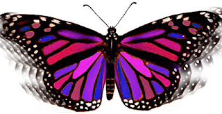
The second project was the butterfly project. I had to adjust the hues and then it modified the colors to make them bright. Then to get the effect on the wings I used the clone stamp to ad onto the wings to make it appear as if it is fluttering.


The third project was the Northwest gradient project. I started with a picture of Olathe Northwest and then I put a text mask over the picture to make the words. The last step was to make the gradient then the gradient went behind the words and in front of the picture.


The last project was the hardest because it had so many steps. The first thing I did was get rid of the cars and lamp posts in the picture of the building. Then I used the magnetic lasso to cut out the picture of the raven, then I got the pictures of the inside of the building and cropped them a little bit. I changed the transparency on the pictures so The background could be seen through.


Photoshop and illustrator are different because in photoshop the deselection key is Command-D but in illustrator the keyboard shortcut is Command-Shift-A. In photoshop the way to make your brush sizes bigger is to hit the brackets but you can not do that in illustrator.


Monday, September 14, 2015

Anatomy Of A Font


For my example of anatomy of a font I used the font Black Cooper. In every font there are things that make it different from other fonts.  Some things you can look for in fonts are stems, extenders, descenders, and many more.  A stem is the straight part in letters like; B, D, E, K, There are more letters that have stems. Extenders are the parts of a letter that rise above the cap height line, letters that have extenders is a lower case d, and a lowercase b. Descenders are the opposite of extenders they go down below the baseline. Some letters that have descenders are a lowercase p and a lowercase q. There are many more things that identify fonts than just stems, extenders, and descenders.

Tuesday, September 8, 2015

My Color Wheel


Colors have different groups. The main group is called primary colors and those colors are red, blue, and yellow. The primary colors can mix and make the secondary colors. The secondary colors are green, purple, and orange. If you mix the primary and secondary colors together you get the tertiary colors which are colors like blue green, and red orange, or red violet. When you add white to colors you get a tint and when you add black to a color you get a shade. If you want the color brown all you have to do is mix all the primary colors

Monday, August 24, 2015

What is graphic design?


Graphic design is communicating something to customers, it includes words, pictures, and colors. The 4 most important things about graphic design is 1. Concept, you need to have a good concept in order to get customers to understand the product and want to buy it. 2. Idea, you also need a good idea so you know how to incorporate colors and pictures. 3. Life, you need to make your design full of color and make it appealing instead of dull and boring. 4. Message, the last thing is that you ned the people to understand what your trying to sell make the designs related to the product.

Three personal connections I have with graphic design is some of the products that I buy is by choosing the better designed product. The commercials that play on tv about products that people are trying to sell, they show the product, logo and make the commercial fun to watch. When I go to restaurants the way they show the food and describe it on the menu helps me make my decisions on what I want to order.