Tuesday, March 21, 2017

Movie Trailer Recreation


Assignment:

The assignment was to pick a movie trailer that took place in school and recreate it. Some of the rules for the project were that we had to recreate the trailer shot for shot and edit for edit.  That means we had to do every shot that was in the trailer. We had to have similar costumes, the same camera angles, and the same length as the real trailer. The purpose of the project was to learn about advanced camera shots and lighting. 

Pre-Production:

I was working with a group of two other people and we chose the trailer Mean Girls. To start the project we began by writing the script, we had to transfer all the lines that were in the trailer onto paper that we printed off. The next step was to create a storyboard of every shot in the trailer. By the end of the storyboarding process my group had a total of 130 shots. After story boarding and writing the script we began to create a production schedule, we picked what days and where we were filming and when. After the production schedule was finished we made and cast and costume list. We started to pick people to play the characters. We also made lists of the costumes each person needed to have. 

Production:

Once all of the pre-production was finished we began the production process. The production process took the longest because of the amount of scenes we had to film. We filmed some of our scenes within the school during class but the rest of the shots were filmed outside of class. We came in on a Saturday to film the in school scenes and once we had finished the schools scenes we went to someones house and shot the party scenes, with each shot we filmed it multiple times to get it right.

Post-Production:

After we had finished filming everything the next step was to begin editing. We started by going through all the clips and deleting the ones that were bad or unusable. After we shorted through the clips the next step was to import them and name them. Once everything was in Premiere Pro and named I began laying them out in the timeline. After everything was laid out I began to synch them to the timing of the real trailer. I would put both side by side and watch them and edit mine to match the real trailer. After everything was matched up I began to search for the music that was in the trailer. Throughout the trailer there were around 5 songs total. The hardest part of editing was getting the timing right with the real trailer. 

Reflection:

Overall I am happy with my project, I like the shots that I got and how they are very close to the originals. I am also happy with how the final edit turned out, it all came together in the end and looks decent. There are also things that I would change if I could go back. I would make sure we had all the shots because we are missing a few. I would also plan it out better and make sure that we know what shots we are filming and when to make sure we don't miss any. I would also go back and film the night scenes again because they are to dark. the only other thing I would change is that I would make sure that we had the extras that we needed because a few of our shots didn't have as many people as we should have so we improvised. The hardest part of the project was time management because we didn't have as much time as we thought and we should have spent more time filming and editing than in pre-production.

Marks and Symbols

Summary:

Marks:
Logos for companies are everywhere, including on clothes, signs, posters, and billboards. As graphic designers there is an importance to know about the different types of marks. There are six different types and they include symbols which is just a graphic with no words, another type is a pictograph which is a graphic that represents a public place, that includes bathroom signs and handicapped signs. The third type of mark is a lettermark which is a abbreviation for a longer company name. Another type of mark is a logo. A logo is the opposite of symbol, except a logo is just the company name and no graphics. When a logo and symbol are combined it creates a combination mark, most companies have a logo, symbol, and a combination mark. The last kind of mark is a trademark, a trademark is a mark which shows that the mark can't be used without permission. 

Symbols:
Many things make up a good symbol which includes thinking about color, reduction sizes, symbol weight, taking negative space into consideration, and many more. There are around eleven things that make a symbol good. After thinking about each one that will help create a well designed symbol for a company. 

Logos vs. Symbols:

While logos and symbols seem like the same there is actually is a large difference between them. Logos include type while symbols don't, logos are the name of the company. Some advantages of using a logo are that they are easier to promote and they are very unique and easy to understand. Symbols are the opposite of logos, symbols are just a graphic and no type. Some advantages of using a symbol are that they are also are unique and easy to see, a disadvantage is that they are hard to understand.

Key Ideas:

After reading the article I learned a lot about developing a symbols and marks. One thing I learned was the six different types of marks. I learned about the different types and what they each are what advantages and disadvantages they have. Another thing I learned was about close gestalt. Close Gestalt is important in designing a symbol and it means that you need something simple and compact to draw the audiences eye to the symbol. The last thing that I learned was that the symbol needs to be able to reduced down to 1/2" or smaller. While being sized down the logo can't loose any of its aspects and still needs to be easy to see. My favorite thing that I learned was learning about developing a symbol. Learning about symbols will be important late in my graphic design career because every business needs a well designed logo, symbol, and combination mark.

Conclusion:

Overall the article was very easy to read and understand. I learned many things about the different types of marks and the components of symbols. I will be able to use what I learned later in my graphic design career. 

Wednesday, February 1, 2017

Music Video Remake


Pre-Production

For the first project we did in the entertainment side of our video class was to pick a song and make a music video for it. The pre production of the project was a lot of paperwork and planning. We had to get the copyright information and then print out all the lyrics. The next part was to begin planning the production of the video, we started by picking a location and figuring our who was going to star in the video. After the general planning was done the next step was to plan out and draw each shot and write about it. We listed the angle, what type of shot it was, and what part of the song it would fit with.

Production

Once we finished the pre production work the next part was to begin production, the group I was in decided to film by the Kansas Bioscience Park and we spent a total of 6 hours spread over three days filming the videos. The filming was a long process that included reshooting many shots and filming them different ways and getting different angles. Once we had a large amount of footage of the main singer we then focused on b-roll shots; shot of the plants and location we filmed at. 

Post-Production

After we had completely finished filming we then began the post production stage. We loaded all the footage onto the computers and began editing. Editing was the hardest part because all the clips looked the same and they had to be fit perfectly to the music.

Reflection

Overall I learned a lot on creating and editing a music video,  I learned how to film one and then start to piece clips together. The hardest part was editing the video to the beat of the music but once it was some what edited to the beat it looked very cool. The parts I really liked about my video was the shots I got, I was very happy with the variety of shots I got and how I edited them together. If I could change anything I would edit more to the beat because it could have been done better. Another thing I would have changed is that I would have a better variety of shots. 

Thursday, January 19, 2017

Posters

The Character and Function of the Poster

In my graphic design class we began to analyze what makes a poster a poster, we started by reading an article about posters and what makes a good poster. The first part of the article was called "The Character and Function of the Poster", it was about what a poster is supposed to do. The first function of the poster is to communicate something about an event, whether it's a political event or a cultural event. The second function of the poster is to get people to notice it by putting it in different location so large groups of people have access to it. The third function of a poster is to also give information in a pleasing way, so information is included along with vivid graphics. Posters are supposed to also convey an emotion that can range from sadness to happiness.

The Laws of Poster Designing

The second half of the article was titled "The Laws of Poster Designing", this half of the article was about how to design a striking poster. The article gave points about what makes a poster stand out from all the others in the same area, the posters need to be striking and be able to get information across in a clear and concise manner, good posters need a balance of color, rhythm, contrast, form and many more to stand out to people and catch their eye. The next thing that good posters have is the general demands of poster-designing, that includes a clear and readable poster, an interesting poster, and a memorable poster. Another thing that is essential to creating a good poster is that it needs to follow lettering in poster-designing. Lettering in poster-design is when all the font used flows and is connected including the size, color, placement, and making sure it is still legible and understandable at a distance. Not only does the font have to connect but the information and graphics also need to connect and have a good balance. Lettering isn't the only thing needed to succeed in creating a stunning poster but a balance between shapes, colors, and graphics need to also be applied to the designing process. The point of the poster should be recognized easily and the colors and shapes need to have a general connection and need to create a pleasing balance. Hierarchy needs to also be applied to making a poster, the information needs to be placed accordingly to importance so the audience can comprehend it quickly. Different placements of shapes can produce a variety of effects, including a more elegant feel, a lighter feel, a more static feel and many more. The feel of the poster comes from the placement and use of shapes. Along with shapes and lettering the color of the poster also makes a difference in the overall feel of the poster. Color can symbolize different things including emotions, color also creates rhythm throughout the poster. 

Importance 

As I read the article I learned about the creation of a good poster and what was included in making it stand out. One thing I learned was about the laws of poster-designing and how by incorporating the rules about shape, color, and lettering that changes the feel of the poster and can make the poster stand out to the people looking at it. The next important thing I learned was the purpose of the poster, everyone knows the basics of a poster but after reading the beginning of the article it makes the function of the poster clear. A poster is supposed to catch the readers eye and make sure the reader can understand the information. The last major thing that I learned was the facts about lettering and how it needs to be balanced and the fonts used need to connect and have a balance with the size and where they are placed. 

My Favorites

My favorite part of the article was when it was taking about the laws of poster-design because they had clear sub titles that told you what the paragraph was about and the points made in the paragraph were also very clear and easily understandable. They will be valuable in the future because when I need to design a poster I now know how to make it eye catching and easy to understand. Overall I enjoyed the information the article had and how it was a easy to read and comprehend writing. 

Monday, December 19, 2016

The Feral Child Feature Story Review

Overview:

I read the Pulitzer prize winner feature story The Feral Child and it was about a girl that was neglected and was locked in a room, with only a few things. She was treated badly and the conditions she was in were very bad; the room was infested with cockroaches, and she was surrounded by her own filth. She was also very uneducated and didn't understand things kids her age should have known, and she is what scientists call a feral child. The authors argument was stating that the girl they found was a feral child, and feral children are kids that grow up with little interaction and how that is a wrong way to treat people. The author shows what makes a child become a feral child and he went through the story of the young girl and how far she has come since her abuse. The author also talks about feral children and what they are and how they got to be the way they are, the author uses other sources about feral children and he gets accounts from witnesses who saw the girl. The author also uses this story about the young girl as an example of a feral child.

Strengths and Weakness:

The articles strengths are that it has an example that explains what the story is about and it gives good details. Another strength is that the article has many different sources having definitions dating all the way back to the Holy Roman Empire and the most recent source which was 1970. A weakness in the article is that the feature story jumps around too much, there are sources from long ago and then it jumps right back into the story about the young girl, and because the feature jumps around a lot it gets confusing and hard to understand.

Conclusions:

The author concludes the feature story by going to the present to see how the young girl has developed and changed, it talks in detail about how far she has come and while she isn't where other kids her age are she has learned more than they thought she would. The story also ends with what consequences the mother is facing because of her abuse towards her daughter.

Summary:

The article was a very well written feature story and it supported all the main ideas of defining a feral child and showing the different cases of them and how rare they are. The article follows the story of a young girl who was a feral child and her mental growth was stunted due to her harsh conditions. the points were very significant because it showed what can happen when kids are treated poorly and how they deserve the best treatment. The evidence is very convincing because there are so many different examples and cases that show all the different feral children and they are all spread out through different time periods which shows how the have always existed and there have always been a few cases. As a videographer I will use the strengths that I found in the article and can apply those to my future work if I chose to go into convergence as my main focus. I can use what I learned about the format of feature stories and use that to make my work better. While the feature story is very well written there are terms in the article that are more difficult to understand and some prior knowledge is needed just for the basics or what a feral child is and how they become feral children. Overall the feature story is written extremely well and while it is slightly confusing at times everything is explained well and it has details to help you picture the girl's living conditions.

http://www.pulitzer.org/winners/lane-degregory


Sunday, December 18, 2016

Graphic Design Reflection

Overview:

Throughout the semester my skills in graphic design my skills have improved quite a bit. Coming into this class in the beginning of the year I knew very little but now after a short semester I have learned about fonts, color schemes, and how to use Adobe Illustrator and Photoshop. Not only have my technical skills improved but my collaboration skills have also improved. My collaboration skills have improved because I got the opportunity to receive feedback from juniors and seniors who are in graphic design and my peers. I have also gotten the chance to work with a partner on a project and run ideas past each other.

Projects:

Photoshop Tutorials:

The first project of the year was Photoshop tutorials, the goal of the videos was to help us get comfortable with the tools in Photoshop and apply them later in graphic design. Each tutorial focused on a certain tool so we could learn in depth what it was for and how to use it. The project took around two weeks to finish completely. While most of the tutorials were short and simple there were a few that were more challenging than others. The one that I struggled with the most was removing certain objects from a picture and while still making it look realistic and not photoshopped. As I was going through all the videos I learned a lot about Photoshop and its tools. I learned how each tool worked and when I should use certain tools over others. Some feedback I received as I went through each tutorial was to take my time and not to rush no matter how simple the tool is. I learned that I need to put forth my best effort for every project even if I don't enjoy it because every project has a lesson about graphic design that is necessary to learn. Overall I think I could have slowed down on the design process because I could have cleaned up each project. Even though I feel like I could have slowed done I am still happy with how they turned out overall.

Fall Raccoon and Postcard:
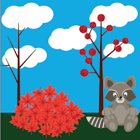
The next project we did after the Photoshop tutorials was to create a fall raccoon and create a postcard, the project was to help us get to know the tools in Adobe Illustrator. The process for creating everything was to first follow a tutorial to design the raccoon and the fall foliage. Once everything was done we began to rough draft our post cards, I decided I wanted a holiday theme. I began to create the things featured in my postcard including the Christmas tree, the fireplace, the stockings, and the Santa hat for the raccoon. Once I had designed everything and had it laid out I started to work with typography so I could include a handwritten font on my postcard. Just like the Photoshop tutorials the raccoon project took around two to three weeks to get all the way through. Some of the challenges that I faced throughout the entire project was understanding the tutorials.
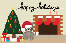
 Since the tutorials were not videos this time but instead they were step by steps pictures it was harder to understand what tools and where the tool were. Throughout the project I learned how to follow directions a different way than before. I also learned the Adobe Illustrator tools and when to use them. I received a lot of positive feedback during this project, I got comments on my handwritten font and how my raccoon turned out. Overall I am much more happy with the process and outcome much more than my Photoshop tutorials. I stayed after school multiple times to get the project done to the best of my ability and I am very happy with
the way it looks overall. 

Vectored Image:
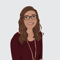
The next project we did in the graphic design was the hardest project and the one that took the most time. Our assignment was to created a vector of ourselves based off of a head-shot we had taken in class a few days ago. The most used tool on this project was the pen tool to trace the parts of the image and the eye-droppper to match the colors as closely as possible. The hardest part of the project was having the patience to finish it. The other hardest part was to get it done in time, I wanted to get every detail in the vectored image and I wanted it to be perfect. I had to learn how to use my time well and get as much done as possible. Throughout the project I learned how to use the pen tool and use a few of anchor points as possible and I also learned how to use tints and shades of colors to show highlights and shadows in my skin and clothes. I am very happy with how my image turned out and I used my time well and I was able to get everything done on time because I stayed after school multiple times to get everything completed. 

Infographic:
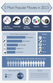
One of the last projects of the semester was to create an infographic about a certain topic. Creating the infographic was my favorite project of the entire year. The process of the project was a lot longer than any other project we had done. On the other projects I was able to just jump in and begin designing but for the infographic we had to do research to know what topics we wanted to show on the poster. The project took the longest, we did research for a week, we planned out the layout, and then we began creating the graphics. The hardest part of the project was figuring out the balance between too much information and not enough information. Once everything was created and laid out we had a critique with the upperclassmen. I got lots of positive feedback and constructive criticism. I was advised to change my font and change the sizes of stuff, but overall they liked where I was going with my infographic. With all the feedback that I received I changed the styles of font numerous times and I also changed the sizes of things. The last thing I changed was the icons of some of the movies I represented. Overall I am extremely happy with how my project turned out and I'm happy that with the time that I had left after I finished I was able to go back and change things so as an end result it looks better than it did. 


Milton Glaser:
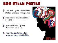
The last project of the semester was too create a presentation of a graphic designer who impacted graphic design history. My graphic designer is Milton Glaser, we started off the project by researching our person and then we wrote a two paged paper over them and then we started creating the slides. For our presentation we have to create a minimum of five slides to show information about our person. The slides have to show their style of graphic design and highlight the most important facts about them.


Time Management:

I feel like overall I have used my time very well in class, and when I don't get everything done that I needed done I will stay after school to finish the project so I can turn them in on time. When I finish a project early I will go back and clean it up in any way possible and I also get others to look at it to give me feedback. Outside of class when I'm not working on any of my projects and I'm driving somewhere I will look at other posters that are created by graphic designers and I will notice things about theirs that I like so I can incorporate things like theirs into my work.


Strengths and Weaknesses:

Some of my strengths as a graphic designer is time management and putting all my effort into a project to make sure it is my best work. I always try to make sure every project is done to the best of my ability. I also try and make sure that all my projects are done on time even if that means staying after school to get caught up. I maximize my strengths by continuing to think about what can be done better and how can I improve this project. My weakness as a graphic designer is being a perfectionist, I always want every project to be perfect and I will spend too much time working on it if I'm not careful and I always have to make sure that I get my projects turned in on time.

Summary:

Overall I have really enjoyed the semester in graphic design and I feel like I have learned a lot throughout the semester. My favorite part so far has bee creating the infographic because I enjoyed picking my topic and designing it completely from scratch. I wouldn't change anything bout graphic design other than not doing another history of graphic design project. My take away from this semester is learning how to balance my time and manage my perfectionist personality to make sure projects get done on time. My goal for next semester is to have everything turned in on time and put all my effort into every project. 

Wednesday, November 30, 2016

ONW feature Story 2

Assignment: Our next assignment in Video was to create another feature story. I chose to create a feature story over my dad and my younger sister on how they play the piano on Sunday mornings at Westside Family Church, and how Darren inspired Sara to begin to play the piano and start to play at church.

Pre-Production:
To start the project I researched the topic of playing the piano. I found out statistics and fun facts about pianos and people who played the piano. After researching the topic I wrote out the 21 interview questions for each person and I decided where I wanted to go with the story. I decided that I wanted to show how Darren played the piano for the church and that inspired his youngest daughter Sara to play the piano for the middle school service. 

Production:
Once I finished writing the questions and researching I started to collect B-Roll and interview Darren and Sara. For the B-roll I got a variety of shots with them playing the piano, Darren working with Sara, and them looking at sheet music together. I also went on Wednesday night to go to Darren;s practice to get shots of the band playing together. After I collected all the B-roll and interviews I downloaded all the footage and began to edit it. 

Post-Production:
After everything was filmed and downloaded onto the computer I began getting sound bytes from the interview. I got the sound bytes by taking the pieces of the interview that I needed to put into the feature story. Once that was done I started to write the script for the voice overs, and placed everything together for the final script. Then I went into the studio and recorded the voice overs and then downloaded them onto the computer. The next step was to piece everything together; I started by laying out the voice overs and the sound bytes into the timeline to get a guide of where I wanted everything. Then I started going through the B-roll and choosing which clips I wanted and where they needed to go to make sure that they feature story flowed. Once everything was in place in the timeline I began to adjust the sound levels to get an even sound throughout the entire video. Once the rough draft of the video was done I watched through the video and made sure I had no jump cuts and if I did to make sure B-roll covered them.

Reflection:
Overall I am happy with my project because I had more than enough B-roll and I talked slower while filming my voice overs. If I could change something I would change the variety of the types of shots I had. I would incorporate more of the six shot system, I would et more close-ups, medium shots, and extreme close-ups. I learned how to get more B-roll and edit the sound to make sure the audio levels are even and I also learned how to create a better feature story. For the next project I will use what I learned about B-roll and how I need more than I think I will.